Toned-down colors or pure color madness - how to arrange a bathroom interior?
Toned-down colors or pure color madness - how to arrange a bathroom interior?
There are bathrooms designed for long, relaxing baths. The kind that allow you to hide and rest after a hard day. There are also those which help boost our energy even at the break of dawn. What is the difference between them? First of all, the colors. How to choose the main color for a dream arrangement?
The character of the bathroom is determined and created by a multitude of elements. The size of the room, the distribution of the most important equipment and devices, the type of materials used, as well as — or maybe above all — the dominant colors. Nothing impacts the atmosphere of an interior as much as colors. What is more, nothing influences our psyche as much as colors do, they can help us relax, or on the contrary — help us gather strength for the subsequent challenges that everyday life throws at us.
What possibilities do individual color palettes offer in the context of bathroom interior design? Turns out, the possibilities are huge!

Toned-down serenity
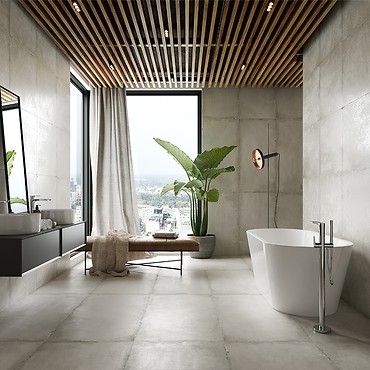
If we dream of a bathing salon where we can have some alone time, the ideal solution are delicate, earthy colors. Toned-down shades of beige and cream, subtle browns, pastel greens and ashen grays will create a gentle and subtle atmosphere that will make us feel safe. The colors will help us find inner peace and harmony, focus our thoughts, relax... It is worth supplementing them with natural materials such as wood, wicker, braided lines, cotton or linen, which will enhance this impression.
White and any off-white shades are a separate category. This most universal of all colors will optically enlarge the interior, creating an impression of cleanliness and hygiene, and it will be an additional “breath of fresh air”.
What is important, all toned-down colors are a great base to play around with other elements of the arrangement. For example, matt stone-gray tiles from the REST collection look great with black accents — fittings, metal moldings, mirror frames, lighting fixtures, and — as a contrast — living green plants or wooden furniture. In such an arrangement, they will create an elegant, harmonious and at the same time original interior.
Abundance of colors
What if we want to use the bathroom to get ready for the new day quickly and effectively? When we are looking for a shot of energy and positive vibes in it? If only we are not afraid of bold solutions, it is worth playing around with colors. Nothing is more invigorating than vivid, energetic colors. We are talking not only about saturated red, but also about joyful shades of orange (!), lively shades of green, intense shades of light and dark blue, as well as sunny shades of yellow. What's more, these colors may make not only solo appearances, e.g. on walls or decorations (on which they appear most often), but also in original combinations.
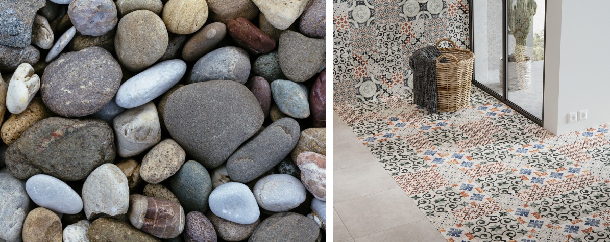
Mosaics and collections inspired by patchwork are worth a look. The very fashionable combination of different motifs into one fascinating whole has become a carrier of extremely original patterns. A good example is the PATCHWORK collection by Cersanit, which was created on the basis of tonal tiles with a light concrete pattern. They are complemented by two intriguing and eye-catching patchwork decors, in which many different colors are combined to create an original yet coherent composition.

See more tips in this category
-
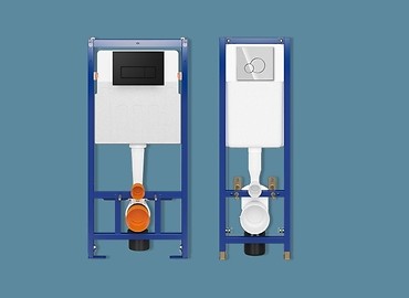
TECH LINE - CONCEALED WC FRAMES AND FLUSH BUTTONS
TECH LINE OPTI concealed WC frames and the ultra-narrow TECH LINE BASE will allow us to save the available ... -
VIRGO - Sign of Beauty
The VIRGO concept collection is a unique proposal for all those looking for stylish, designer solutions ...